روش ساخت hero در صفحه نخست سایت

با استفاده از flex ها میتوان کارهای قشنک و اصولی ساخت یک نمونه hero صفحه نسخت است که در این آموزش گفته میشود.

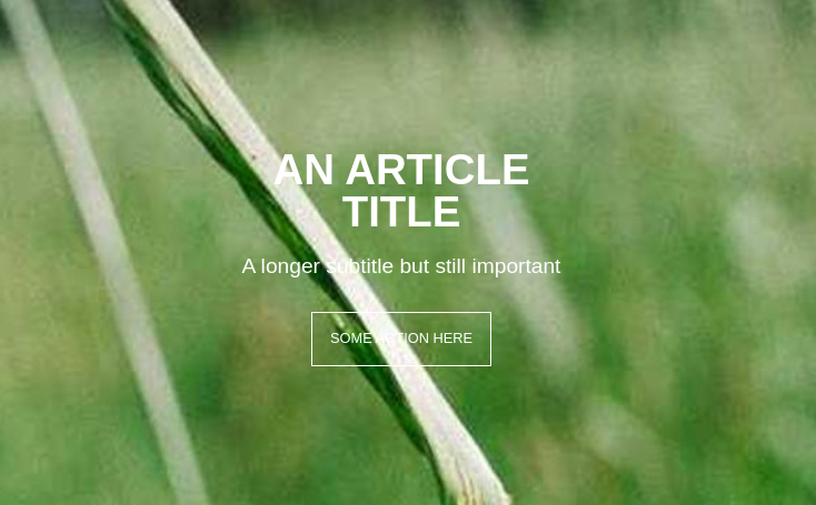
<header class="hero">
  <div class="center-content">
    <h1>An Article Title</h1>
    <h3>A longer subtitle but still important</h3>
    <a href="#" class="button">Some Action Here</a>
  </div>
</header>
.hero {
  background-image: url("https://unsplash.it/1500?random");
  background-size: cover;
  background-position: center;
  width: 100wh;
  height: 100vh;
  display: flex;
}

.center-content {
  width: 400px;
  display: flex;
  flex-direction: column;
  align-items: center;
  margin: auto;
}
.center-content h1, .center-content h3 {
  color: white;
  line-height: 1;
}
.center-content h1 {
  text-transform: uppercase;
  font-size: 3em;
  margin-bottom: 0;
  text-align: center;
}
.center-content h3 {
  margin-bottom: 40px;
  font-size: 1.5em;
  font-weight: normal;
}

.button {
  text-transform: uppercase;
  color: white;
  padding: 20px;
  border: 1px solid white;
  text-decoration: none;
}
.button:hover {
  background-color: rgba(255, 255, 255, 0.1);
  border-color: rgba(255, 255, 255, 0.7);
  color: white;
}

جهت نمایش نسخه لایو

جهت انیمیشن شدن در حالت hover css

a{
     -o-transition:color .2s ease-out, background 2s ease-in;
     -ms-transition:color .2s ease-out, background 2s ease-in;
     -moz-transition:color .2s ease-out, background 2s ease-in;
     -webkit-transition:color .2s ease-out, background 2s ease-in;
     transition:color .2s ease-out, background 2s ease-in;
}

کد فوق باید در a باشد

تغییر اندازه ستون های bootsrap 4 با flex

گاهی اوقات لازم است که اندازه استاندارد col-lg-3 را کمی کاهش دهیم اما ستون کناری که col-lg-9 است مقداری فضای خالی در سمت راست اضافه میشود

bootstrap 4 از سیستم flex-box استفاده میکند و ما بدون نیاز به دست کاری متغییر ها و استاندارهای آن از ۲ کلاس کمی استفاده کنیم مثلا

<style media="screen">

.col-side-right{
  flex: 0 0 20% !important;
  max-width: 20%;
}

.col-side-left{
  flex: 0 0 80%;
  max-width: 80%;
}

</style>

<div class="row">
  <div class="col-lg-3 col-side-right">
    
  </div>
  <div class="col-lg-9 col-side-left">
    
  </div>
</div>


دو کلاس col-side-left و col-side-right با تغییر درصد های پیش فرض col-lg-3 از ۲۵٪ به ۲۰٪ باعث کوچکتر شدن عرض col-lg-3 میشود

درج تصویر پس زمینه بعد از متن در CSS

سلام برای خود من سوال بود که چطوری میتونم کاری بکنم که بعد از عنوانی که برای یک منو انتخاب میکنم بتونم یک طرح گرافیکی را قرار بدم یک راه حل کاربردی را برای شما دوستان معرفی میکنم.


.title_with_bg
{
font-size:14px;
font-weight:20px;
}
.title_with_bg:after {

background: url("../img/title-bg.jpg") no-repeat;
display: block;
position: relative;
width: 20%;

padding-bottom: 1%;
background-size: 100%;

content: "";

display: inline-block;

}